This is part of a series of posts in which we’ll take a look at some page layouts from established charity websites and see how we might go about recreating something similar using the native WordPress block editor.
This is for educational purposes only – copying other sites’ designs verbatim isn’t cool, and you should always aim to fit the design around your content, not fit your content into someone else’s pre-existing design.
The purpose of these posts is to demonstrate the flexibility of the default block editor and to show that with a few custom tweaks and a few types of content block created for your individual site, you can create a wide variety of layouts and designs.
Let’s start off with an easy layout – the Cancer Research UK one. Their homepage changes regularly but here’s what it looks like in September 2023.

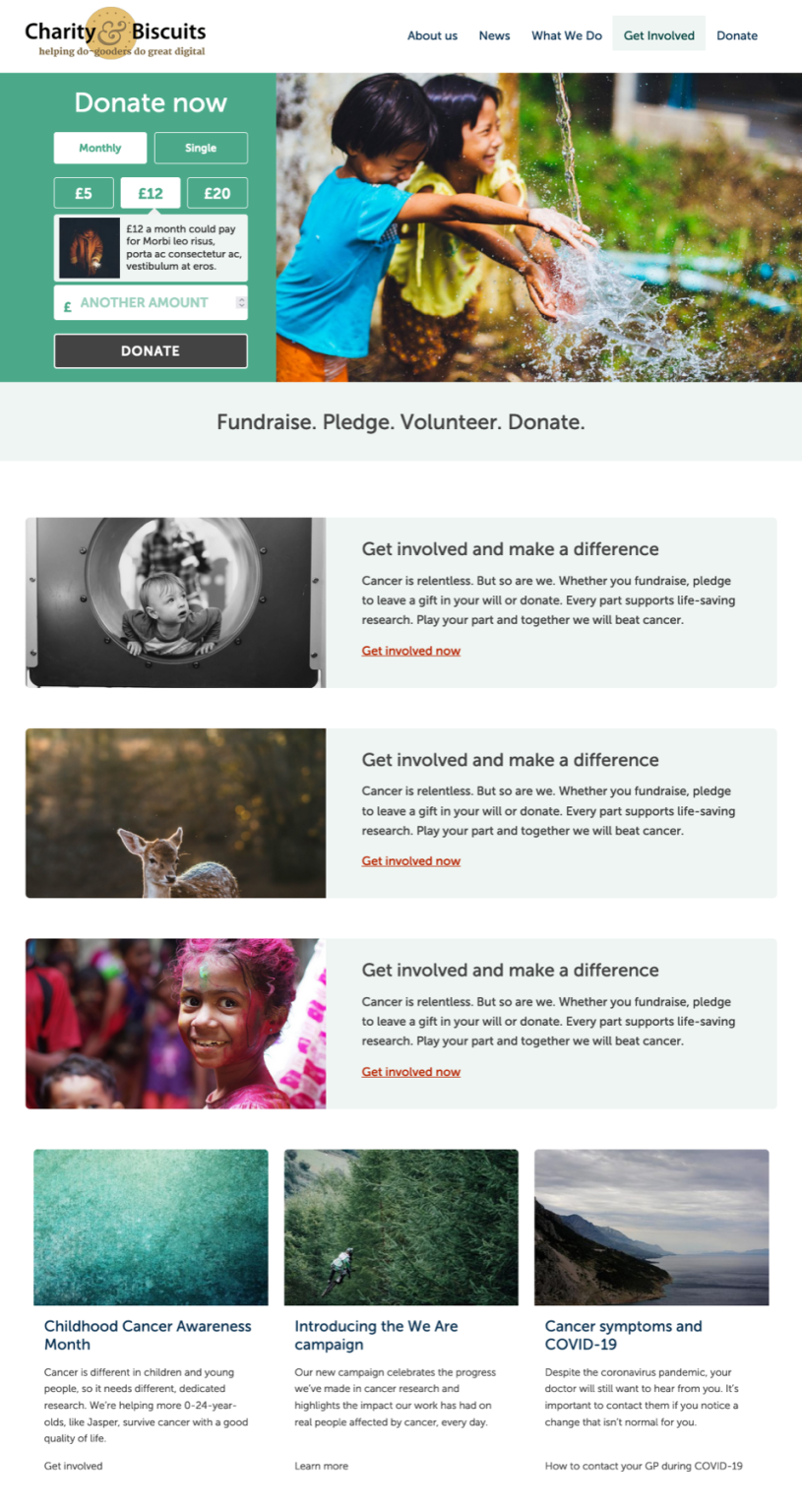
It’s a nice and simple design. There’s a donation box as the main call-to-action at the top of the page, followed by three more boxes, followed by three more boxes in a three column layout.
Recreating it in WordPress
The donation block at the top isn’t easy to recreate in WordPress without a bit of custom work. You could add in a Cover block, full width, at the top. Then insert a Columns block in that and add in a form into one of the columns, leaving the others empty. But for the purposes of this demo I’m going to insert a custom made Donation prompts block that I use and configure for some of the WordPress sites that I build.
The strapline area is pretty easy. Just add that in as a Heading block. Centre the text, then Group it and apply a full width and coloured background to the Group.
The three boxes underneath could be created in a couple of different ways. You could add them in as Columns blocks, with the image in one Column and the content in the other. But the default WordPress Media and Text block is great for this kind of layout and we’ll use that.
In my case I have decided to add in a light coloured background to each box, whereas the original CRUK one just keeps it as white.
To add in a bit of white space / breathing room between the blocks, I have added in a Spacer block. The default WordPress one is fine, in my case I have extended it so it has a series of pre-built sizes to choose from.
For the three columns underneath – again you could use the Columns block and create three columns, each with an Image, Heading, Paragraph and Link. Because the row of cards/boxes is a common layout feature, I have my own custom Block called Featured Cards which allows you to input each element and it will build/style the content for you so they are all uniform.
So my layout comprises the following blocks:
DONATION PROMPTS (custom)
HEADING inside a GROUP
SPACER
MEDIA & TEXT
SPACER
MEDIA & TEXT
SPACER
MEDIA & TEXT
SPACER
FEATURED CONTENT AREAS (custom)
If you want to recreate the CRUK style of having the images have that rounded bottom shape then that’s easily done with a bit of CSS code – you don’t need to use Photoshop or Canva on the images themselves. You can then use this image style in other blocks if it’s a brand/design style that you want to repeat throughout the site.
Here’s a screenshot of my version:

Here’s a video walkthrough of me creating it from scratch in less than seven minutes:

