Enlist now if this is you:
- You’re a small charity that wants more donors, fundraisers etc?
- You’re finding it hard to compete with big rivals with big pockets?
- You have a website but people don’t seem to really engage with it?
 First up – the shouty sergeant major with some harsh words of truth
As a Joe Public website visitor I might well care about your cause, but I don’t really give a toss about your charity.
All your projects sound the same to me. Your news is dull and navel gazing – I’m not interested that you won an award, or have found a new corporate partner, or have got a new CEO.
A lot of the things you seem to think are important are actually just important to you.
And now the good news…
People don’t really give a toss about your rival charity with the famous name and huge budget either. You absolutely can compete with them if you can tell a more compelling story.
And if you get better at telling the difference between things that are important to you, and things that are important to your website visitors.
Here’s the 5 step programme to get your charity website fighting fit to attract fundraisers
1What’s your story?
a.k.a. Your elevator pitch. Write it in 2/3 sentences. Let’s take Comic Relief as an example as everyone is familiar with them. Theirs might be: ‘We raise money via our telethons to help marginalised people in the UK and Africa’.
2Who was the ‘hero’ of your story?
If it was all about your charity then you should rewrite it (if you want more donors, fundraisers, volunteers anyway). See how that in that previous example, the story was all about ‘what we do’?
3Rewrite your story
But this time, you are the sidekick. Your donors, fundraisers, volunteers are the heroes.
Let’s have another stab at the Comic Relief one: ‘People like you in workplaces, schools and families across the country can have fun whilst transforming the lives of some amazing people. You’ll feel really proud of that when you see what an amazing and vital impact difference you can make.’
Write yours, polish it and stick it up on the wall next to your computer. This is the new frame of reference for your website. The lens through which all your content should be viewed.If you want some more guidance I highly recommend going through the exercises in Winning The Story Wars.
4Whilst you’ve got the Blue-Tac out, Copy this and stick it on your monitor.
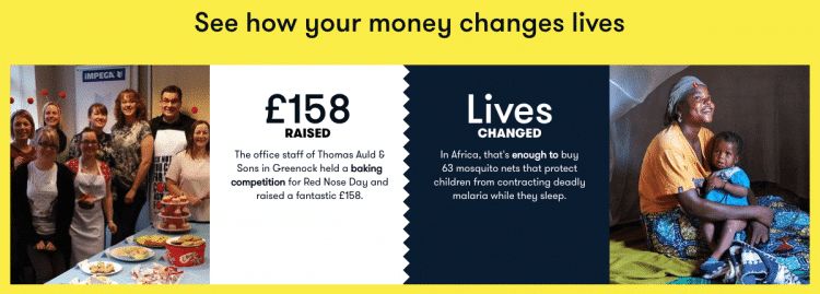
PEOPLE RELATE TO PEOPLE, NOT TO PROJECTS OR PIE CHARTS.People donate to help people (or cats, or rainforests), not to help a charity. Or to put it another way, we generally give with our hearts, not our heads. Look at Red Nose Day for example; Comic Relief funds a lot of charities, each with multiple projects, spanning numerous issues – but it’s hard to create an emotional connection to a charity, project or issue. That’s why they zero in on the stories of individual people for their fundraising appeals – because people relate to people.

Comic Relief make great use of ‘fundraising journeys’ like these. It’s clear from this who is the ‘hero’ of this little story. 5Do a quick audit of your homepage and other important landing pages
Tot up the number of times these words appear
You or I (referring to the site visitor or your supporters) I or we (referring to beneficiaries) We or Our (referring to your charity) ? ? ? If there’s not much in columns one and two compared to column three, then your site isn’t as audience-centric as it could/should be. That’s OK – now we know the site visitor is the star of your story we can edit our content to reflect that.
Next steps
There’s plenty tips and advice within our blog posts about writing content that’s audience-centric not charity-centric. And I’ll publish more tips in the near future with some suggestions about your homepage, Get Involved section, Latest News etc.
Charity Website Bootcamp: 5 Steps to get your Site Fighting Fit and Fundraiser-Friendly Share on X
OK. but…:
Shouldn’t our beneficiaries be the heroes of our story?
Of course they’re the most important people/animals/rainforests to you, and they should know that. But most of the time they’re not the primary audience for your website. If you want people to donate/fundraise/volunteer you have to create a connection with them.
It’s really important to show your beneficiaries’ stories and to hear their voices, and the great impact that has been made. But the risk is that you can relegate the reader/viewer to becoming a passive onlooker. You don’t really want them to think ‘That’s great. Sounds like you don’t really need my help‘.
They should be thinking ‘Look what I can do, this is amazing/urgent/will make me feel really good about myself for having got involved‘.
We’ve got really low running/admin/fundraising costs. That’s a big attraction for donors isn’t it?
Erm… no. Not in my opinion. Of course it’s good to be able to demonstrate value for money and that you run a lean ship. To me though, that shouldn’t be your main story or your unique selling point. It’s putting you as the hero of your story and therefore it’s not really engaging for your visitors.
It’s a great thing to reinforce and validate their decision to become a supporter once they’ve been persuaded to get involved… but it’s not the thing that will persuade them in the first place. I might write a blog post with more thoughts on that later.


 First up – the shouty sergeant major with some harsh words of truth