Cut to the chase.
That’s the message of this blog post. For me, one of the biggest differences between a good charity website and a mediocre one is the amount of ‘fluff’ text that’s spread throughout the site.
Fluff text is words that don’t really need to be there. It’s the sentences that are taking up space and that people almost certainly won’t read anyway. The paragraphs that clog up your website without adding anything useful to it.
I’m not talking about the content of blog posts or news articles, I’m talking about the words on your home page and other ‘landing pages’ or section home pages like the ‘Get Involved’, ‘Events’, ‘Shop’ etc. sections where people are in ‘scanning’ rather than ‘reading’ mode.

Examples of fluff text include:
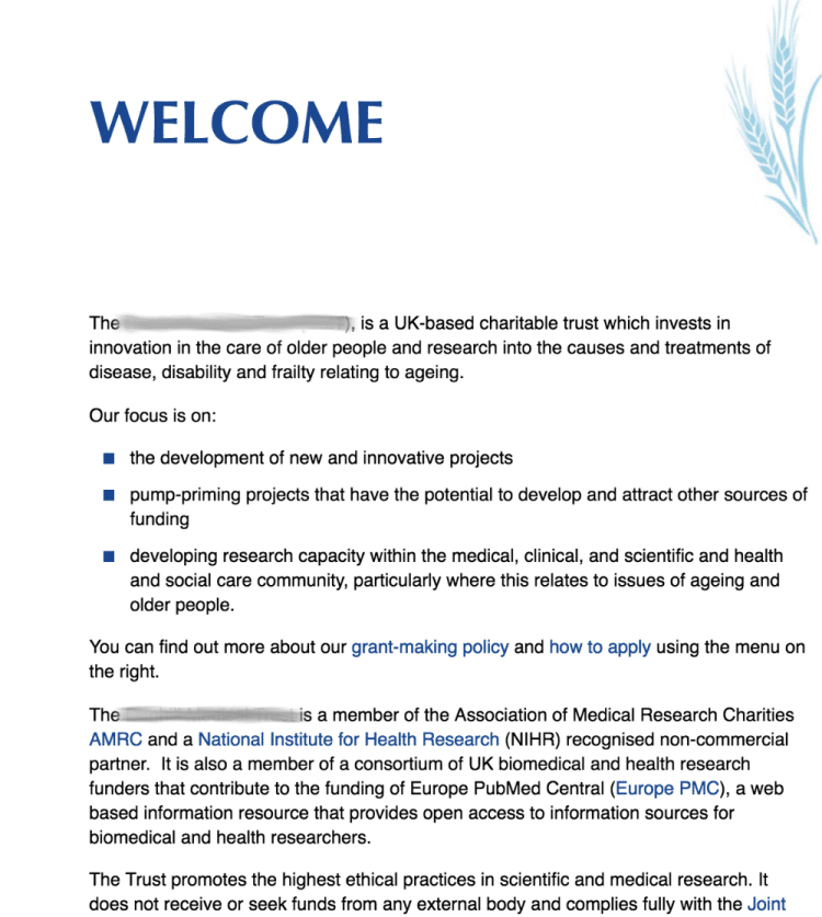
- Welcomes – I don’t think you need to actually welcome anyone to your website or thank them for visiting. A welcoming website is one that’s easy to use and understand, and that tells your story in an engaging and compelling way.
- Superfluous instructions – People know how websites work, so you don’t need any text that tells them to ‘click on one of the links below to …[whatever]’.
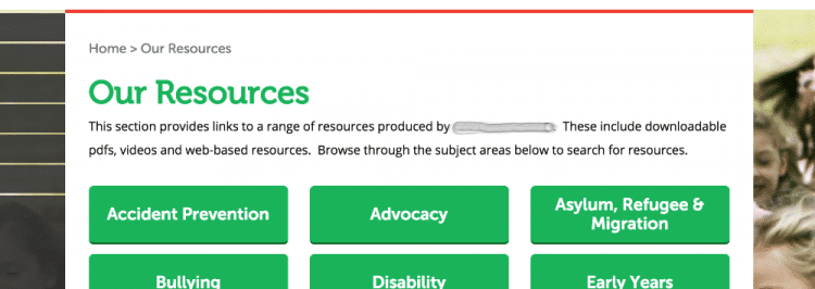
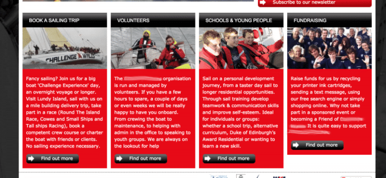
- Unnecessary context or explanations – This is the main culprit. You don’t need any text to explain what’s on the page, as people will just see for themselves. Remember – ‘show’, don’t ‘tell’. This also includes excessive explanations about each subsection contains, if it’s pretty obvious just from the title.
Let me illustrate this point with some examples taken from the websites of charities local to me. These are quite typical of most charity sites and they could easily be made a little bit better. And because this is a case of removing text, it’s something you can do yourself without the need for paying a web designer or agency.

This is hardly a big deal, but on pages like this I don’t think the introduction sentence serves any useful purpose.
Quick tip: Re-use your Twitter bio.
If your charity is on Twitter then you hopefully have done some work sweating over how to sum up your charity and your work in 160 characters for your Twitter bio. That’s a great place to start. Put that nice and prominently on your homepage instead of the 300 words of text you’ve got there at the moment.
People don’t read websites, they scan them.
That’s an old web design adage but it’s still useful to bear in mind. On your home page and other section pages (like What We Do, Get Involved etc) most users will subconsciously scan the page looking for where to go next. If you don’t want them to press the ‘back button’ or visit another website instead then you’ve got about five seconds to engage their interest and point them in the right direction.
The upshot of this is that people will just skim right over your ‘fluff text’ – it’s a learned behaviour we all have after having visited thousands of websites. But even though fluff text is virtually invisible, it’s still a visual distraction and makes it more likely that your page will fail the ‘five second test’.

No free ride
Every paragraph, every sentence, every word on your website should be there on merit. That’s the difference between professionally copywriting your website content, and just ‘filling it up with text‘. My advice would be to pick the five most important pages on your website and for every one ask yourself ‘does this sentence really need to be here?’ You might find that you can easily get rid of half your text.
What about news articles, blogs etc?
It’s more reasonable to expect that people will ‘read’ these rather than ‘scan’ them looking for something. It’s still likely though that they’ll be skim reading, which is why I’d recommend breaking up the text into subsections if it’s more than a few hundred words long.
It’s hard to look at your own site objectively
I don’t always follow my own advice, and I’m aware that I’m a serial waffler in some of my blog posts. It’s definitely easier to spot the fluff text on someone else’s website. If you didn’t write any of the words and you don’t already have a mindful of knowledge about the charity – then it’s much easier to spot the woods from the trees.
But that’s not to say that you can’t hoover up some of the fluff text that’s clogging up your own site. You might be surprised at how many sentences you can remove without anyone even noticing!
Find out some more of the 10 things I’ve learned from 10 years of writing charity communications.


